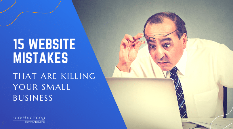
Is your website showing any of these signs that it is in need of a makeover? Websites are like all tech- they need to be regularly updated. Here we look at 15 common reasons that you may need to take your website for a full makeover.
Have you ever noticed that wearing activewear sneaks up on you (particularly during COVID)?
It starts just one day when you forget to get changed after your walk. And then before you know it you live in stained, baggy trackie-dacks with t-shirts holier than the turf at the MCG (UGG boots optional).
Small business websites are like that. They start out looking brilliant and shiny new and you make a high commitment to keeping them trim, taught and terrific. Then business gets in the way, and you start to get comfortable … really comfortable.
Eventually, your best friend quietly sidles up to you and whispers out of the side of their mouth, “I think it’s time for a makeover”.
Think of me as that best friend.
If your small business website has any of these stains, holes or signs your website is untrustworthy … then honey, it is definitely time for a makeover.
Your small business website needs a makeover if …
1. It’s a landing strip
Old website designs squeezed the text and images on your website into a skinny landing strip in the middle of the screen. If you have a landing strip website, it is showing your age faster than screaming out “Rad” or “Hang loose” at a rave.
Modern website designs totally fill the desktop screen/tablet with glorious colour and images.
Think of the difference like when you go to a cinema (you may have to think back a bit, when going to the movies wasn’t seen as an extreme COVID sport). When you first arrive, the cinema shows cheesy ads in a tiny portion of the screen. You know you are getting to the good bit when the curtains pull back to the full width of the massive screen, and the image expands to the very edges.
It’s time to lose the landing strip and supersize your site to take advantage of modern screens.
2. It has cringe-worthy photos
We all have a good laugh at the clothes and hair we used to wear. Me? I was sure my Afro perm looked fabulous in the 80s.
You can pick the era of a website by the stock images they use and what is in the photo.
When was your last photo shoot? If you haven’t updated your photos of yourself in the last decade, then you are showing your age.
If your photos show cars or utes that haven’t been seen for a few decades, if the clothing or hairstyles are more Dynasty than Kardashian, and if the cheesy stock photos are showing their age – it’s time for a website makeover.

3. It has been “Coming Soon” forever
You had a friend of a friend of a second cousin whip up a one page “Coming soon” sign for your website. The only problem is that the page has been up since Kevin Rudd was Prime Minister (the first time).
Or you had a one-page website that just had your logo, your name and a phone number on it, figuring that would hold things for a while. Well it is time you finally arrived – it’s time for a website makeover.
4. It has mission brown colour schemes
Ok. You may not have mission brown and avocado on your website, but colours do go out of fashion.Early websites loved intense blue or red 3D buttons that pulsed at you when you looked at them. These are now a dead giveaway of age.
If you haven’t refreshed your colour palette with your brand for a few years – it’s time for a website makeover.
5. There are cobwebs on your SEO
If your SEO strategy for your site consists of seeing how many times you can shove your keyword into a sentence (and not worry if any human can actually read it) for example: “Heart Harmony Communications are Brisbane web designers who build websites for Brisbane small businesses. If you need a small business website in Brisbane look to these Brisbane web designers” – it’s time for a website makeover.
This also goes if you have tried to game Google by white text on white backgrounds, making words in teeny tiny font, showing 4 million keywords in your ALT tags or filling your website footers with every suburb in a 100km radius. These games are all toxic and can see Google slap you silly.
6. You have rusty code
Would you race your vintage (meaning never been serviced) Datsun 180B at Bathurst? You wouldn’t make it round the first bend before blowing a gasket and creating a smoke hazard on the track.
Many old sites have broken bits of code hanging off them everywhere. You look at the site and links don’t work, images don’t show up and some pages simply never load. No-one is game to update anything in case it all falls apart.
We are seeing a lot of this happening for many small businesses. Web Designers built cheap WordPress sites for people using free or budget themes, which have since been abandoned. These themes have limped along for years, but the latest round of WordPress changes are breaking things left, right and centre.
The code that runs your website may have been state-of-the-art back in its day. But if it is more than 5 years old (and if the theme that runs it hasn’t been updated in years) – it’s time for a website makeover.
The other problem, is that old code is full of security holes. The longer you leave it, the more likely it will be that your site gets hacked.
7. It’s full of someones that I used to know
Employees (and executive members) come and go. But if your site still is pining over someone who left more than a few weeks ago – it’s time for a website makeover.
Regularly review the photos and content on your site to make sure they reflect only current employees and Directors, and ensure that the right people are profiled (in many small businesses you want the owner profiled and not a hundred photos of the girls in reception).
Previous staff and staff turnover are just the least of secrets your website reveals. Check out some of the other secrets your website is sharing!

8. If it’s full of things you don’t do anymore
We all know that service offerings for small businesses change over time. You pick up new services and discontinue old ones.
But if your website still tells everyone about what you used to offer, and not what you currently offer, it is like walking into a takeaway food place and finding that the blackboard menu has lines through everything except for the battered flake.
This is even more important if your website is showing old pricelists or offering discounts on services you no longer provide.
Your website should always reflect your most current service offerings (and rates ) and not make people guess what you do.
9. It uses free Email accounts
Remember how excited we were when we first got email? That’s when Hotmail and other free email accounts were in their heyday.
If you still have a Hotmail account (or Bigpond or Optus or Gmail) as your primary business account, you are wearing the equivalent of a Walkman – it’s time for a website makeover and an upgrade of your emails to match your URL to reflect your professional image.
10. You have stuffy web copy
If your web copy reads like you have taken a bath in starch, and then rolled in jargon – it’s time for a website makeover (… and I can recommend a particularly brilliant Brisbane web design agency that also writes killer web copy!)
The words on your website should enlighten and not hide what you do. They should make it easy for people to understand exactly what you offer and how you offer it. They should give an experience of what it would be like to work with you.
Are you corporate, straight to the point, quirky or friendly? Your words need to reflect the clients you want to attract and the experience they will have when they work with you.
11. It’s silent when it should be talkative
Almost as bad as stuffy web copy is non-existent web copy. People come to your website because they want to know more about you. If your web copy consists of a few random sentences filled with platitudes and no substance, then people will click away in droves.
The words you use on your website are vital, and need to answer the three vital website questions:
* Do you have what I am looking for?
* Can I trust you?
* Are you up to date?
If your web copy doesn’t answer those questions, then you are due for a makeover.
12. It’s not mobile responsive
If your site is only viewable on a nice large desktop computer, and you issue a microscope to anyone who wants to read your site on a mobile device – it’s time for a makeover.
Old website code is not mobile responsive which means the screen does not reconfigure when people view your site on mobile phones or tablets.
Given that Google has moved to mobile first indexing because most people view websites on tablets and phones these days, you need to get on board!
But if your site was built in the early days of creating mobile responsive sites, in many cases you may be running two or more versions of your website – one for desktops, one for phones and one for tablets. If you have more than one version of your site to cater for this new-fangled mobile technology – it’s time for a website makeover.

13. It’s S-L-O-W to load
Old websites took ages to load (and we were happy to wait around for them). Modern sites need to be speed demons and load in 3 seconds or less. If your site takes 5 seconds to load, it is estimated that you will lose 90% of your potential clients.
If your site is slow, it’s time for a website makeover.
14. It doesn’t have a Padlock (SSL)
If your website URL starts with http:// and not https://, and if you can’t see a padlock in your browser bar, it means your website does not have an SSL installed to protect your visitors.
All good web hosting companies now offer free SSLs, but you do need to do a few things to properly convert your website to work with the SSL (and no – shoving in a Simple SSL plugin is not a proper fix).
If you don’t have the padlock, it’s time for a website makeover.
15. It isn’t converting
The reason that you have a website is to attract new clients. If your website is just a glorified brochure, and it isn’t really doing anything for your business, then it’s time to rethink your site and give it a makeover. Good websites WORK! Bad websites simply gather virtual dust.
Conclusion
So. How did you go? Any of the 15 signs that your site needs a makeover (or at the very least a few decent website repairs)?
My rule of thumb is you need to review your entire website – both design and content each year.
Every second year, do some minor renovations to freshen up your site.
Every five years – blow the whole lot up and start again.