What are the most common complaints about business websites? One of the questions we ask new clients is what bugs them about their existing website, and websites in general. Over the years we’ve collated their responses into the 10 most common complaints people have about websites. Check to see if your site has any of these problems.
One of the questions we ask new clients is what bugs them about their existing website, and websites in general.
Over the years we’ve collated their responses into the ten most common complaints people have about websites. You can use this list to check your website to see if people may be having the same issues about your site.
We have split this list into two categories: Technical Complaints and Content Complaints to make it easier to check your website for these problem areas.
Website Technical Complaints
1. It’s too slow to load
If a website page takes too long to load, your potential customers are likely to click off the page and go elsewhere for their information.
According to Google, when page load time increases from 1 second to 5 seconds, the probability of someone leaving the page increases by 90%. And if page load time increases from 1 second to 10 seconds, the probability of someone leaving the page increases by 123%.
Slow sites cost you customers!
So, what is a good load time?
Google recommends best practice for page load time is under 3 seconds.
But this isn’t just a nice recommended benchmark. Since July 2018, page load speed is a ranking factor by Google for mobile searches. This means, if your page is slow, it gets pushed down in search results.
However, not only will your slow pages be hard to find in Google, and people will click away from them before they fully load, slow load times can also have an impact on how many pages on your site the Google bots can crawl and index during their limited crawl width budget. If it takes more than one attempt for the Google bots to crawl a website, it can lead to longer wait times before your website content is viewable on Google.
How fast is your website?
To check the speed of your website, there are several free online tools you can use.
- Pingdom tests the loading speed of your site and give it an A to F speed ranking and tell you exactly how long it took to load.
- GT Metrix is another brilliant tool that looks at a range of performance measures for your website.
- Google’s Page Speed Insights is Google’s page speed tool.
If your website is slow to load, the number one cause is fat or uncompressed images. Sort those out first before moving onto other strategies to speed up your website such as adding caching, or swapping out resource hog plugins/themes. If you are not sure where to start, we are happy to work with you to speed up your website.
2. It’s not mobile responsive
In 2016, we reached a tipping point where more people browse the internet on their smartphones than on desktop, and yet many websites still are not fully mobile-friendly.
If your site isn’t optimised for use on mobile and tablet devices, it’s difficult to read the content and navigate through your site, which means that people leave in frustration to go to other websites that are mobile responsive.
If your website is more than three years old, it is likely it is not fully mobile responsive.
One thing to know: In March 2018, Google changed how they index and rank websites to Mobile-First Indexing. This means that when Google uses the mobile version of your site instead of the desktop version to index and rank your website in search results. If your website isn’t mobile-friendly, it can lead to a drop in your search rankings.
3. It looks outdated
If someone’s first impression of your website is “this looks like it was built in the 90’s”, then it is a good sign that your site might not be what your customers are looking for.
One of the first things a customer looks at when they hit your website is its design. People look at your website design and judge:
- Is it modern?
- Is it easy to read?
- Is it so cluttered that they can’t find anything?
Some of the clues that your website is outdated and in need of a makeover are that it is boxy with content shoved into a narrow landing strip section in the middle with a block style background around the edge, uses old colour schemes, or it uses tiny font.
Modern sites are clean and use a lot of white space, extend the full width of the screen on a desktop and adjust to all size mobile devices, have a larger font and are easy to navigate.
So, if your website looks and responds like it’s the first website ever made, it is time for an upgrade. We recommend a site review each year for content and image currency, a design tweak and modernisation every two years, and a full blow up and redesign every five years. After all, a lot changes in your business and the tech world in 5 years!
4. It’s not secure
People crave security on the internet, and one of the critical clues they look for is the padlock icon on the left-hand side of the browser’s URL bar when people visit a website.
When this padlock is green/black (depending on your browser), it indicates that the website has an SSL certificate installed and all communications between the browser and the server are encrypted.
While an SSL doesn’t stop hackers, it does protect your visitor’s private information they enter on contact forms or through your store from man-in-the-middle attacks.
There are several SSL checkers on the net to test if your SSL has been correctly installed on your website, although most are run by companies with a vested interest in selling you one of their paid SSLs. Use one of the tools but check with your hosting to see if they offer a free SSL as part of their hosting package before forking out any money.
Internet security is such a big priority to Google that in 2017 they started showing a “not secure” warning on websites that did not have an SSL installed, to warn visitors not to enter their details on the site.
However, a large proportion of websites that have an SSL installed have not correctly migrated their content, so their website is showing people a mixture of secure and not secure content (called mixed content). Mixed content weakens a page’s security and is a significant threat to your clients.
This can happen because their web designer relied on a plugin to force things to load via SSL (in reality, all that happens is the image URL redirects rather than natively serving via a secure link).
From December 2019, Google is targeting mixed content and will start to gradually block mixed content from displaying in browsers. What that means is that bits of your website will not be visible to clients if they are classed as mixed content.
What should you do?
- Check your site has an active and correctly installed SSL.
- Check you have no mixed content on your site (Jitbit has a free SSL check that will crawl up to 400 pages of your website and help find any non-secure images etc.)
If your site does not have a padlock, or you have mixed content, we can help get your site safe and secure.
5. It’s unstable
Having a website that is always up and ready to be viewed by customers is crucial when it comes to running a business. When your site does not load, then customers can’t see your content and can’t contact you.
Every website will have moments of downtime (even on premium hosting) when servers are updated. But you want this downtime to be as little as possible.
A site that continually jumps between being up (able to be seen on the web – also known as uptime) and being down (not loading and can’t be seen) can either be a sign of poor quality hosting or of a hack.
Unless you are on your site every minute of the day, you may not be aware of how stable or unstable your website is.
One way to check how stable your website is, is to use a free monitoring service. Uptime Robot is a free service that pings your website every few minutes and will send you an alert if your site goes down and when it comes back up again. We use it for all of our sites.
If your site is unstable, then it is time to review your hosting and to thoroughly check your site for signs of hacking or malware.
6. You can’t see the page because of pop-ups and requests to send notifications
Have you ever been to a website where the minute that the page finishes loading, the screen is covered by one or more popups asking you to sign up for the newsletter or get a free quote on a service? Yes, pop-ups can work to increase sign-ups to your list, but they will also annoy a stack of customers, and also annoy Google, which will see your search result rankings penalised.
In 2017, Google introduced penalties to websites that have what is known as interstitial popups on their mobile version of their site.
Interstitial popups are boxes that cover the entirety of a page and do not go away until they are either dismissed by the user or a time limit that is built into the popup expires.
As Rand Fishkin said (all-round SEO guru and bloke with the coolest beard on the internet):
“So, Google’s new mobile guidelines … now state that if an overlay or a modal or something interferes with a visitor’s ability to read the actual content on the page, Google may penalise those or remove their mobile-friendly tags and remove any mobile-friendly benefit.” – Rand Fishkin Moz https://moz.com/blog/popups-seo-whiteboard-friday
What if you want to have popups on your website?
- Don’t have them show on any version of your site that displays on smartphones.
- If you want to use a pop-up on your desktop version of your website, use either a scroll or timed pop-up. This means, use a pop-up that only triggers once the reader scrolls to a certain point down the page, or when they have been on your website for a certain amount of time.
This is where you need to test what works best for your audience, as there are no hard and fast rules for the ideal pop-up settings. Things to check:
- Test delaying your pop-up for 10, 20 30 and 60 seconds and look at sign-up rates vs bounce rates.
- Test setting different scroll depths – 50% of the page or 75% of the page.
- Test only displaying your pop-up on exit intent (when someone hovers to the top left of the page to click the back button).
- Test only displaying your pop-up once a day to a visitor to your site and not on every page they visit.
7. Cheesy stock images
Using images bought from image libraries (i.e. stock images) on your website is a great way to give your site a professional look and finish without the cost of paying a professional photographer. We love DepositPhotos as it has a brilliant range of images at a great rate.
However, when picking the photos for your website, make sure that the images match your business, where you operate and what you do.
Over the years we have worked with companies located all over Australia, and we have found that one of the biggest problems that we have discovered is sourcing images that are specific to the country that the company is located in.
Before you use any stock imagery on your website, make sure that all the little details from the power points and light switches to the city in the background of the photos are right for your location.
If you are a tradesperson, then invest in photoshoots from a real estate photographer to get real before and after shots that show your work. People want to see what you have done, and not one prepared by someone else. It is like buying a meal at a Michelin starred restaurant and trying to pass it off as your cooking.
Also, match the images to your client base. If your clients are predominantly middle-aged or older, then your pictures need to reflect that and not just young barely-out-of-their-teens models.
Finally, make sure the images are not stuck in cheesy poses. Arms above the head in celebration. Shaking hands. Awkward pointing. Modern photos are more casual, fun and real.
Read more about stock image sins here: https://www.heartcomms.com.au/common-website-mistakes/
8. Broken links
Have you ever been to a site where when you click on a link or a menu, instead of taking you to the page you wanted to see, you are taken to somewhere completely random or to a 404 page not found page? Then you have encountered broken links.
Most sites get a few broken links each year from things like articles mentioned in a blog post being deleted or moved, but when they are a part of your site navigation or a link to another page on your website, then they start to annoy customers.
To check if your website has any hidden broken links, go to https://www.brokenlinkcheck.com/. This site crawls every link on your website and tests them all to make sure they are working correctly. If you do find any broken links on your site, either delete the link or fix them with the correct link.
If your map is broken, then you need to fix the “this page can’t load Google maps correctly” error.
Content Complaints
9. You can’t find the information that you need about the company
One of the most common issues that we see when it comes to content is that the information that customers want is jumbled or simply isn’t there.
When someone navigates to a website, they are looking for three key things:
- Who the company is,
- What they do, and
- How to contact them.
If the content on the website is hard to read or doesn’t clearly explain what your business does, this can cause them to look for a different company to provide the service they are looking for.
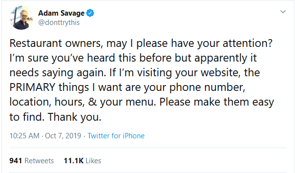
Adam Savage (ex- MythBusters) described it best in this tweet:
“Restaurant owners, may I please have your attention? I’m sure you’ve heard this before, but apparently, it needs saying again. If I’m visiting your website, the PRIMARY things I want are your phone number, location, hours, & your menu. Please make them easy to find. Thank you.” – Adam Savage
If finding a way to contact you via your website is like a game of pool Marco Polo, then customers won’t contact you.
Some of the main contact issues that we find with websites can be fixed by doing three simple things:
- Don’t hide your email or phone details to avoid spam: Use an email bot harvester blocking plugin instead.
- Make sure that your contact forms work by testing them regularly.
- Make sure your phone number is correct and visible on every page (ideally top right of every page).
10. Spelling and grammar errors
If the content on a website is riddled with spelling and grammar errors, this creates a negative impression. 85% of people report that spelling and grammar influence their opinion of someone’s competence.
Spelling and grammar is also a ranking factor for Google and Bing.
“ … just as you’re judging others’ writing, so the engines judge yours. If you struggle to get past typos, why would an engine show a page of content with errors higher in the rankings when other pages of error-free content exist to serve the searcher?”
Duane Forrester
Sr. Product Manager, Bing
We understand that it may seem cheaper to get writers off websites like Fiver to write the content for your site rather than hiring a fantastic copywriter. However, this can lead to writers for whom English is a second language creating content that is not only hard to read but also full of spelling and grammar errors.
There is no point in having content on your site that actively turns Google and your clients away! Invest in quality copywriters to get the best results.

Last Thoughts
So how did you go? If you look at your website through your customer’s eyes, does your site have any of those top ten website complaints?
1. It’s too slow to load
2. It’s not mobile responsive
3. It looks outdated
4. It’s not secure
5. It’s unstable
6. You can’t see the page because of pop-ups and requests to send notifications
7. Cheesy stock images
8. Broken links
9. You can’t find the information that you need about the company
10. Spelling and grammar errors
These ten website complaints not only make your business look bad, they will also cost you customers and Google rankings. The good news is that they are all wonderfully fixable.
If you find any of these common complaints on your website, get in touch.